Understanding the impact of correlated color temperature (CCT) in interior design is crucial for creating the desired ambiance in any space. CCT not only affects how we perceive the environment around us but also influences the mood and atmosphere of our living areas. This guide will explore how different design styles can benefit from specific CCTs, helping you harness this element to enhance your interior design projecs effectively.
Correlated Color Temperature (CCT) refers to the color appearance of light, measured in Kelvin (K). It influences whether light appears more orange (warm) or blue (cool). Warmer temperatures, typically around 2700K to 3000K, emit a cozy, yellowish glow ideal for relaxing environments. In contrast, cooler temperatures, about 5000K and above, emit a bluish-white light that mimics daylight, known for its energizing properties. Neutral temperatures, usually around 4000K, provide a balanced white light that is often used in spaces that require clear visibility and concentration.

Image source: Pinterest
Traditional interiors, such as Classic, Victorian, and Mediterranean, often incorporate warm CCT to enhance their rich fabrics, ornate furnishings, and detailed woodwork. This warmth adds to the inviting and homely feel, making spaces feel snug and welcoming. The gentle glow from a warm light source beautifully accentuates the deep wood tones and intricate patterns typical of traditional decor.
Modern and contemporary designs, known for their clean lines and minimalist approach, typically pair well with neutral to cool CCT. This temperature range helps maintain a crisp, stark aesthetic that highlights bold architectural elements without the distractions of overly warm tones. In contemporary settings, a cooler CCT can also complement metal finishes and glass features, enhancing the sleek and polished feel of the space.
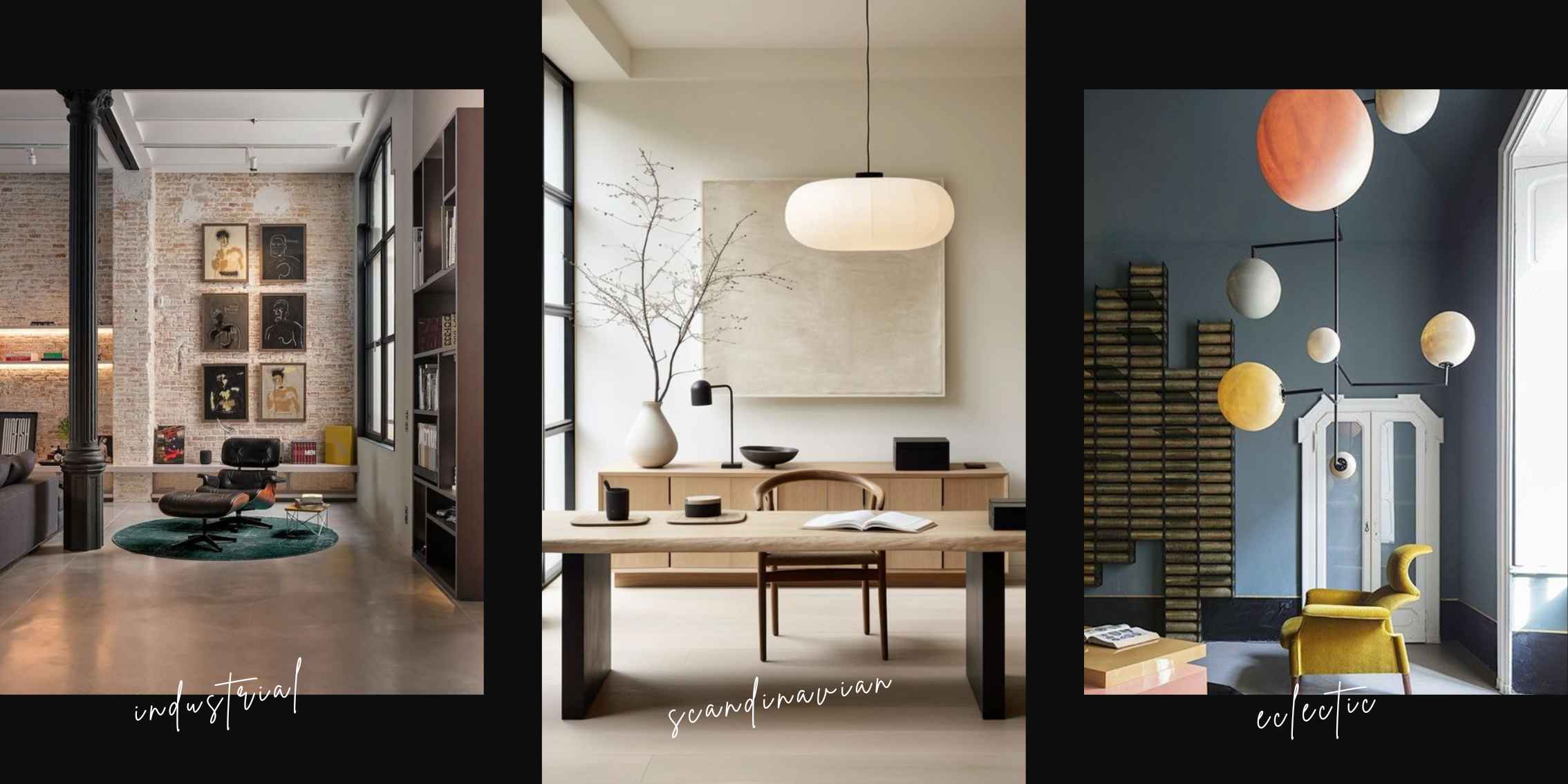
In industrial and urban interiors, cooler color temperatures are often employed to reflect the raw, unfinished aesthetic. The cooler light emphasizes exposed structures like steel beams, brick walls, and mechanical ducts, reinforcing the edgy and rugged character of industrial environments. These settings benefit from the sharp contrast and shadows that cooler CCTs provide, which accentuate the textures and materials commonly found in such spaces.
Scandinavian and Nordic styles prioritize bright, airy atmospheres, making great use of neutral to cool CCTs. These temperatures support a design ethos that values daylight, simplicity, and minimalism. By mimicking the clear, natural light of the outdoors, cool and neutral CCTs can make small spaces appear larger and more open, enhancing the serene and tranquil vibe characteristic of Nordic interiors.
Eclectic and Bohemian interiors thrive on a blend of warm and cool CCTs, reflecting their varied and vibrant nature. These styles often mix and match elements from different eras and cultures, creating dynamic and visually interesting spaces. Using a combination of CCTs can highlight this diversity, with warmer lights enhancing comfort and cooler tones bringing a dash of modernity.

Image source: Pinterest
Cultural preferences also play a significant role in selecting CCT. In regions that receive less natural light, warmer temperatures may be preferred to add a sense of warmth and comfort. Conversely, areas with ample sunlight might opt for cooler temperatures to create a refreshing and calming indoor environment. Understanding these cultural nuances can guide designers in choosing CCTs that not only enhance the design aesthetic but also resonate with the inhabitants'cultural context.
Choosing the right CCT requires consideration of the room’s function, natural lighting, and desired ambiance. For instance, warmer lights can make a room feel smaller and cozier, which is ideal for personal spaces like bedrooms and living rooms, while cooler lights can make a space feel more open and alert, suitable for kitchens and bathrooms. Experimenting with adjustable CCT lighting can offer flexibility, allowing you to change the atmosphere based on the time of day or the specific needs of a space.
Correlated color temperature is a subtle yet powerful element in interior design. By selecting appropriate CCTs for different design styles, designers can profoundly impact the mood and functionality of a space. Whether you aim to create a vibrant and eclectic living area or a calm and minimalist study, understanding CCT will help you achieve your design goals more effectively.

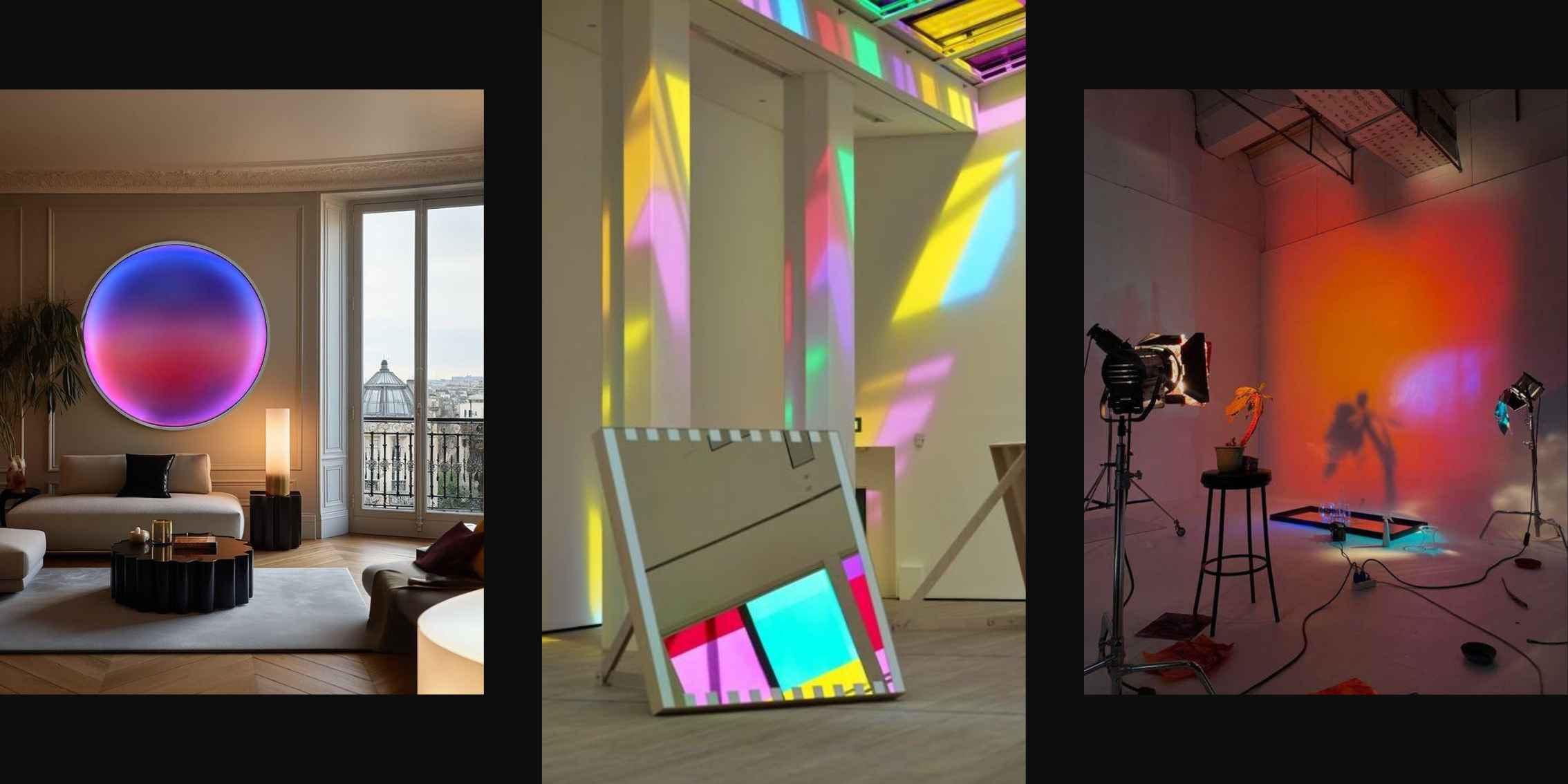
Image source: @nickthomm and Cosmos
Ready to uncover the secrets of interior design and dive into the fascinating world of correlated color temperature? Module 5 of our online interior design course is where the magic happens!
Join us at The Interior Design Institute and let's explore the art of lighting together. It's a journey filled with discovery and creativity. With our 7-day money-back guarantee and self-paced learning, there's no better time to join. Got questions? Contact us today!