

Choosing your first palette feels intimidating. Most people worry about picking "wrong" colors when they should be focusing on how those colours work together.
Top interior designers don't just guess which shades look good. They use a system to build authority into a room through light and contrast.
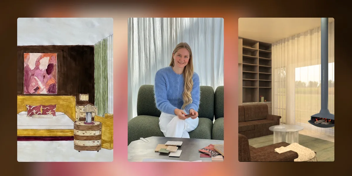
In this guide, our interior design tutors explain how you can use simple rules to create a home that feels balanced and intentional. Learn more about our tutors.
In short…
We teach you the science of light and pigment in our online interior design course. It’s the best way to turn your creative eye into technical expertise.
 Image Source: The Interior Design Institute.
Mastering the color wheel allows you to predict the mood of a room. Interior designers use these three basic paths to ensure their projects feel balanced rather than flat or chaotic.
Follow this 3-step interactive hook to build a professional scheme in seconds.
 Image Source: Muse Design Studio.
Don't believe the myth that one color is boring! It's actually a masterclass in texture and depth. This approach makes a room feel expansive and serene. It's why monochromatic schemes are the first choice for luxury hotel suites and modern minimalist homes.
 Image Source: Vogue Australia.
Pastels are officially growing up in 2026. They're the secret to adding color without the visual noise or the "nursery" association.
The 2026 forecast is ditching artificial brights for "grounded joy" and earthy, natural connections.
For more interior design color trends, check out our blog: What is Dopamine Decor? Exploring the Maximalist Revival.
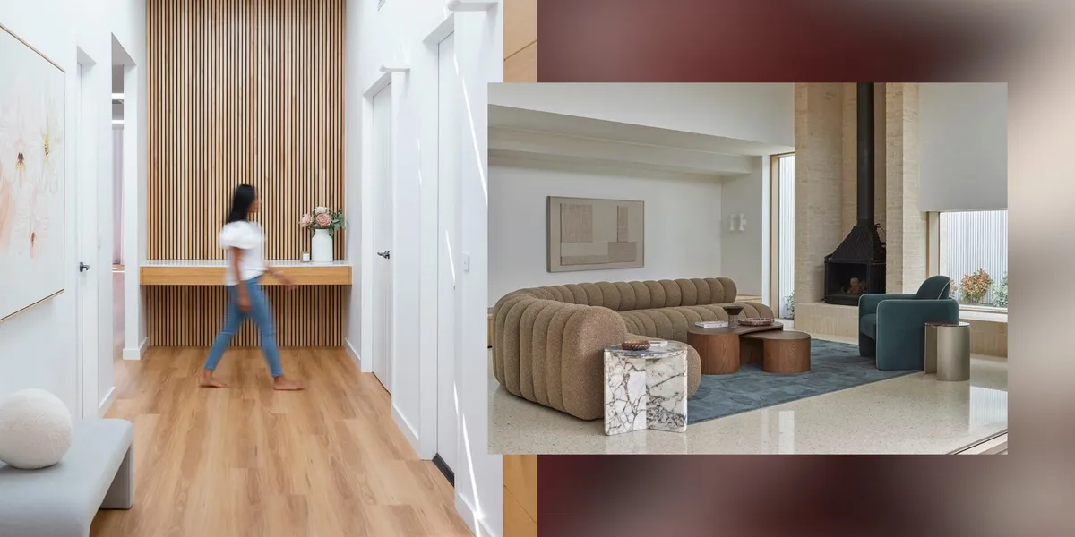
Neutrals are the high-performance workhorses that stop your home feeling like a random collection of rooms.
Expert Tip: Always check your neutral swatches in the morning and afternoon. South-facing rooms need warm undertones to balance cool natural light, while north-facing spaces thrive with cooler neutrals to handle the warm sun.
 Image Source: The Interior Design Institute.
This rule is the secret sauce for a professional finish. It stops you from overusing bold colors and ensures your room feels cohesive rather than messy.
 Image Source: The Interior Design Institute.
Use these visual anchors to find the right mood for your project. When it comes to color palettes, interior designers should start with a clear vision of the final atmosphere.
Go deeper and test your creativity in our Beginner's Guide to Creating Analogous Colour Schemes for Any Space.
 Image Source: @interieurcharmeur.
Even experienced designers can fail if they ignore these foundational principles. Don't let these three common traps ruin your palette.
 Image Source: @tash_lickcolour.
You've seen how a few smart rules turn a random palette into a professional scheme. The real secret to high-end design is mastering the science behind the hues.
In Module 6 of our online interior design course, we teach you how light and psychology alter the mood of a space and help you master the technical paint systems and specifications that pros use every day.
Download our free prospectus to see how your eye for style can become a certified career.
Light neutrals and cool pastels reflect light and make walls feel like they're receding. This makes a small space feel airy and larger than its footprint. Avoid heavy color in windowless rooms unless you're creating a dramatic jewel box effect.
Pick one hero color and carry it through every room to create a red thread. You might use it as a wall Color in the hall and an accent on lounge cushions. This unified approach stops your home feeling like random rooms.
Yes, we definitely recommend it. A cool blue room needs the warmth of wooden furniture or brass lamps to feel balanced and comfortable. Our online course explores this science of contrast in depth to help you create harmonious spaces.
Yes. Painting a dark room white often makes it look dingy, so embracing deep navy or forest green is a better choice. This creates a cosy, dramatic effect that works well with layered lighting.
Pin fifty images of rooms you love to a digital mood board without overthinking. After a week, you'll see a pattern in your favourite color and textures. You can master how to translate these patterns into professional designs in Module 6.
Textiles are the fastest and cheapest way to change the mood of a room. Swap your cushions, throws, and rugs for a fresh hue. This lets you test a new palette without the permanent commitment of paint.
White walls look yellow when their undertones are amplified by warm afternoon sun. Switch to a cool white with a grey or blue base to neutralize that warmth. This technical fix is a staple of professional spatial planning.
Embark on a journey of inspiration, creativity, and expertise through our array of Interior Design blog posts featuring insights, student showcases, and expert tips.

©2026 The Interior Design Institute. All rights reserved.